
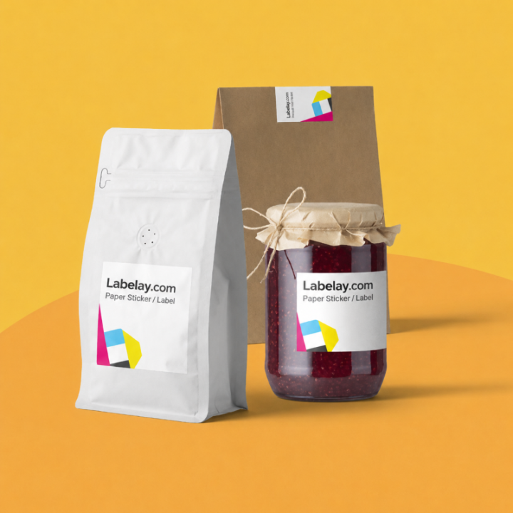
Food jars can force a surprising amount of information into a small label. Brand name, product type, flavor, weight, ingredients and other required information all compete for space, while the package still needs to look appetizing and intentional.
The solution is not simply making the label larger. Good jar labels use hierarchy, contrast and surface area efficiently. Material choice also changes how much visual weight the label adds to the package.
Give the front panel one clear job
The front-facing area should communicate the brand and product quickly. Secondary details can move to side or back areas instead of shrinking every element until nothing is easy to read. Think of the jar as several viewing zones rather than a single crowded rectangle.
If the jar contents are visually attractive, Clear Labels can preserve that visibility. If the product color is inconsistent or busy, White Labels create a controlled background.
Material can reduce or add visual weight
Paper labels feel intentionally present and can suit sauces, preserves, honey and specialty foods with a handcrafted brand direction. Clear film can make the jar itself become the visual background. White film sits between those approaches by providing full opacity with a clean surface.
Before choosing, compare the options in the Material Guide and consider how the jar looks when full, half full and empty.
Protect small text with spacing
Ingredients and supporting information often become hard to read because they are squeezed against edges, curves or decorative graphics. Give small text its own quiet area with enough contrast and line spacing.
Print the artwork at actual size during proofing. A paragraph that looks comfortable at 200 percent zoom can become dense on a two-inch label. Our Artwork Guide covers file setup and safe areas.
Measure the usable jar area, not the entire jar
Curves near the shoulder or base can reduce the flat area available for a label. Measure the section where the label will actually sit and leave room for application tolerance. A slightly smaller label that lies flat often looks better than one that reaches into difficult curves.
Once the dimensions are known, compare quantities and materials through Get an Instant Price.
- Use the front panel for brand and product identity.
- Move dense supporting information away from the visual focal point.
- Print a full-size paper mockup before production.
- Measure the straight wall of the jar rather than the overall height.
Turn the guide into a real specification.
Choose your material, size, shape, finish and quantity, then see the price before checkout.