
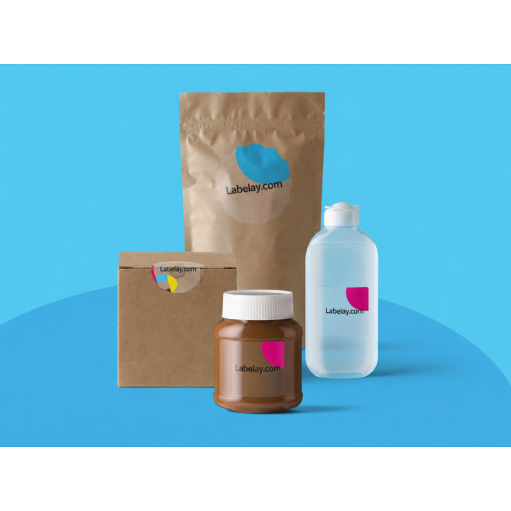
Clear labels are appealing because the package remains visible through the material. That transparency can make a bottle or jar feel cleaner and more integrated with the artwork. It also changes the way color behaves. Without an opaque background, the container behind the label becomes part of the printed result.
White ink gives you control over that interaction. It can sit behind printed colors, appear as a visible part of the design, or be omitted from selected areas so the package continues to show through. Understanding those choices before artwork is finalized makes clear label production much easier.
If you are still deciding whether transparent material is right for the project, start with our Clear vs White Labels guide. If clear is already the plan, this article explains the role of white ink in more detail.
Why printed color changes on transparent material
On white label material, the face stock provides a bright background behind the ink. On a clear label, that background is missing. Printed color is seen together with whatever sits behind it: clear glass, amber glass, colored plastic, a dark cosmetic container or even the product inside the bottle.
That matters most for light and medium colors. A pale peach graphic that looks bright on a white screen or white proof can become subdued when printed transparently over a brown bottle. A light blue may shift visually over a green container. White elements in the original artwork cannot simply be assumed to appear white unless white ink is actually specified.
What is white underprint?
White underprint is an opaque white layer printed beneath selected color artwork. Think of it as creating a controlled white base only where the design needs it. The process colors are then viewed against that white layer instead of directly against the container.
This can be useful for logos, product names, illustrations or blocks of color that need stronger opacity. The rest of the clear label can remain transparent, preserving the “no-label” effect around the artwork.
A white underprint does not have to cover the entire label. In fact, one of the strengths of clear material is the ability to combine opaque printed zones with transparent negative space.
What is spot white?
Spot white means white ink is intentionally printed in specific areas as part of the visible design. For example, a white logo can sit directly on a clear bottle while the surrounding label remains transparent. White text, icons, borders and graphic details can all be created this way when the artwork calls for them.
The distinction is useful:
- White underprint sits beneath color to increase opacity and reduce the influence of the container underneath.
- Spot white is white ink used as a visible design element in its own right.
- No white leaves printed colors more transparent and lets the package influence them more strongly.
A design can use more than one of these approaches in different areas.
When should you use white underprint?
Consider white underprint when brand colors need to remain strong and recognizable, when the container is dark or colored, or when important artwork would otherwise lose contrast. It can also help when a design contains fine details that need separation from the package behind them.
Underprint is especially relevant when the same clear label design will be applied to containers with visually active backgrounds. A transparent beverage, a colored liquid and an amber bottle each create a different background. Providing white beneath key design areas makes those areas less dependent on the package color.
When does printing without white make sense?
Not every clear label needs white ink. In some designs, transparency is the point. Dark typography on a pale or transparent container can remain highly legible. Transparent color effects can look intentional and premium when the package underneath is part of the composition.
The question is whether the transparency is a deliberate design choice. If a color becomes translucent accidentally, the finished label can feel weaker than the artwork preview suggested. If it becomes translucent because the design was planned around the bottle or jar, the result can be distinctive.
The container color should influence the artwork plan
A clear glass jar gives artwork a relatively neutral background. An amber bottle adds warm brown. A black cosmetic container adds a dark field. A white plastic bottle may already provide enough visual contrast that some transparent areas work well without additional white.
Before deciding where to place white ink, view the design in the context of the actual container. A flat artwork file on a white design canvas hides the most important variable: what the customer will see through the label.
Use separate design intent for transparent and opaque areas
The clearest artwork instructions identify which parts should be transparent, which parts need white underneath, and which parts should print as visible white. Ambiguity at this stage creates avoidable production questions.
For file preparation basics such as resolution, bleed, safe areas and font handling, review the Labelay Artwork Guide. For expectations around printed color, also see Print & Color Tolerances.
Avoid using a white background just to simulate opacity
Design software often displays transparent artwork over a white canvas. That visual preview can be misleading because the white screen background is not automatically a printed white layer. If opacity is important, it needs to be communicated as a production requirement rather than left as an assumption.
The same applies to a white rectangle placed behind artwork. If that rectangle is intended to become actual printed white, it should be clearly identified. If it is only a temporary design background, it should not accidentally become part of the final label.
What about fine white text?
White text can look striking on clear packaging, but very fine reversed elements deserve attention. Extremely thin strokes, tiny lettering and intricate knockouts can be less forgiving than larger design elements. The practical solution is to keep critical white details comfortably legible rather than pushing them to the smallest possible size.
This is also why artwork checks matter. A file can be technically printable while still benefiting from small adjustments that improve the final package.
White ink and the “no-label look” are compatible
There is a common assumption that using white ink defeats the purpose of a clear label. It does not. A clear label can still disappear visually around the printed design while selected artwork areas receive enough opacity to remain readable.
For example, a skincare bottle might use a small opaque logo and product name while the rest of the label remains transparent. A beverage label can use white beneath a colorful illustration while leaving large sections of the bottle visible. The combination often gives designers more flexibility than choosing between “fully clear” and “fully opaque.”
Plan the label as a system
The strongest clear label designs consider four layers together: the package, transparent label material, white ink strategy and color artwork. None of those layers exists independently in the finished product.
Start with the actual container. Decide what should remain visible. Identify the artwork that needs controlled opacity. Then determine where visible white belongs. Once those choices are clear, the production file becomes much easier to communicate.
You can configure size, shape, quantity and finish on the Clear Labels product page or compare a standard configuration with Get an Instant Price. If the project needs a non-standard white ink treatment or an unusual application, send the details through Request a Quote so the requirement is clear before production.
Turn the guide into a real specification.
Choose your material, size, shape, finish and quantity, then see the price before checkout.