
Premium packaging is often mistaken for more effects: more metallic detail, more typography, more borders and more visual layers. In practice, products that feel considered usually have fewer competing decisions.
A strong premium label uses hierarchy, spacing and material deliberately. Specialty surfaces can help, but they work best when the artwork gives them room.
Reduce the number of visual priorities
Decide what the customer should notice first, second and third. If the logo, product name, descriptor, illustration and badge are all fighting for equal attention, the package feels busy rather than premium.
Use size, weight and spacing to create a clear reading order.
Use empty space as part of the design
Unprinted space gives important elements more presence. It also allows the container or specialty material to become part of the composition.
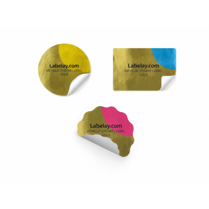
This is especially useful with Clear, Silver Metallic and Gold Metallic Labels.
Choose one strong material idea
A clear no-label effect, a tactile paper surface or a selective metallic highlight can each carry a premium concept. Combining every effect at once often weakens the result.
Use the Material Guide to choose the material that best supports the brand story.
Judge the complete package, not the label alone
Premium perception comes from the relationship between label, bottle, cap, box and product. A simple label on a well-considered container can feel more refined than a complex label applied to a visually conflicting package.
When the design is resolved, proof it at actual size and configure the final specification through Get an Instant Price.
One useful final test is subtraction: temporarily remove a border, badge, icon or decorative effect and compare the package again. If the hierarchy becomes clearer without it, the simpler version is often the stronger premium direction.
Turn the guide into a real specification.
Choose your material, size, shape, finish and quantity, then see the price before checkout.