
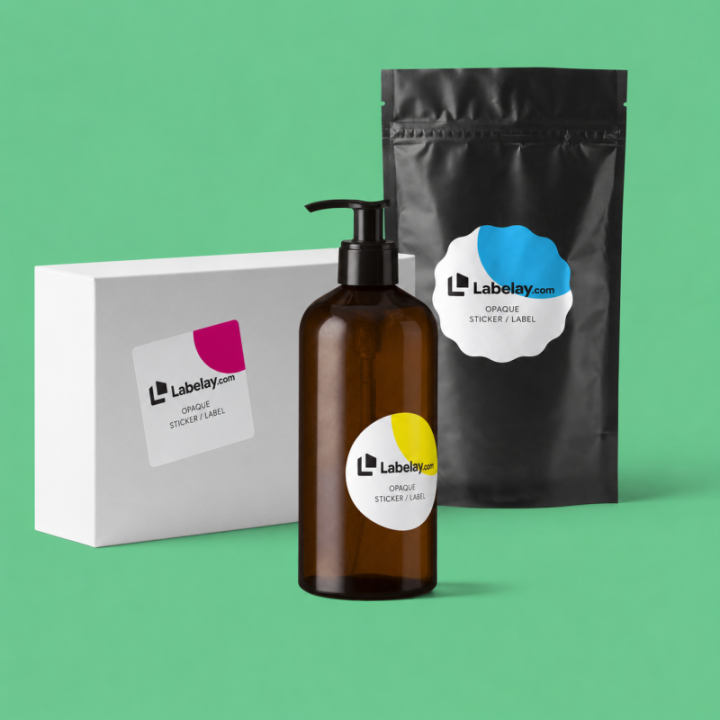
Supplement packaging is a layout problem before it is a decoration problem. Bottles are usually cylindrical, the label wraps around a limited area and the design may need to accommodate a significant amount of information.
The goal is not to make every element equally visible. It is to build a hierarchy that helps the customer understand the product quickly while keeping smaller supporting text organized and legible.
Create distinct front, side and back zones
The front panel should communicate brand, product name and the most important differentiator. Supporting information belongs in clearly defined secondary zones rather than creeping into every empty space.
A wraparound label becomes easier to manage when it is designed as a sequence of viewing panels instead of one continuous crowded canvas.
Use a controlled background for dense text
White Labels are a practical choice when the design includes a lot of small type because the background is predictable. Clear material can work, but every important text area must be evaluated against the bottle and product color.
If the bottle is dark, opaque or highly colored, readability should take priority over transparency.
Print a full-size proof before approving typography
Text that feels comfortable on a monitor can become very small when wrapped around a real bottle. Print the artwork at 100 percent scale and hold it at normal reading distance.
Check line length, contrast, spacing and whether text disappears around the cylinder sooner than expected.
Keep production margins realistic
Avoid putting critical information directly on cut lines or extreme curves. Give the design enough safe area so small production variation does not compromise the layout.
Review the Artwork Guide for bleed and safe-area preparation, then use Get an Instant Price for the final dimensions.
Turn the guide into a real specification.
Choose your material, size, shape, finish and quantity, then see the price before checkout.