
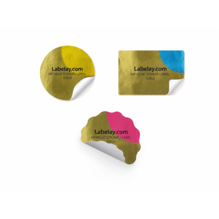
Gold metallic labels are often chosen to make a product feel premium, but premium packaging rarely comes from making every element gold. A restrained design allows the material to create highlights while typography and color remain easy to read.
The goal is to use Gold Metallic Labels as a material layer, not as a decorative filter placed over an ordinary design.
Choose the areas that deserve reflection
A logo, border, small illustration or product name can benefit from metallic emphasis. Leaving selected areas unprinted allows the base material to provide the gold effect directly.
If every background and graphic reflects equally, the eye loses a clear focal point.
Balance warm gold with printed color
Gold introduces warmth into nearby colors. Deep green, black, cream and burgundy can create strong contrast, but the right combination depends on the brand rather than a universal palette.
Avoid judging the design only from a flat digital mockup because reflected light changes the physical appearance.
Protect readability
Fine gold text on a busy background can disappear when the package moves. Important information should have enough tonal separation to remain readable from normal viewing distance.
Small regulatory or supporting text is usually better treated as functional typography rather than as part of the metallic effect.
Use gold when it adds meaning
Gold can signal a premium tier, limited release or warmer brand identity. It is less effective when added simply because the material looks expensive in a sample.
Compare gold with Silver Metallic and Holographic Labels in the Material Guide before choosing.
Before approving a gold label, place the artwork on the actual bottle, jar or box and check it under both soft and direct light. The areas that look balanced on a flat monitor may reflect much more strongly on the finished package, so this physical check is especially useful for deciding how much gold should remain exposed.
Turn the guide into a real specification.
Choose your material, size, shape, finish and quantity, then see the price before checkout.