
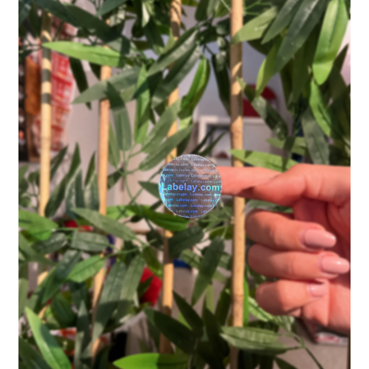
Holographic material is visually active. Its color shifts and reflected patterns change as the package moves, which can create strong shelf impact but can also compete with small artwork.
The best Holographic Labels use the material strategically. The goal is to decide where movement is useful and where the design needs a calmer, more stable reading area.
Leave room for the holographic effect
If the entire label is covered with dense opaque artwork, the base material has little chance to contribute. Use negative space or selectively printed areas so the holographic surface can remain visible.
This creates a stronger contrast between active and quiet parts of the label.
Do not put every important element on a changing background
Small text and detailed logos need consistency. A highly reflective background can shift from light to dark depending on angle, so low-contrast typography may disappear temporarily.
Give critical content a controlled printed area or use strong enough contrast to remain readable through movement.
Use simple shapes and confident typography
The material already supplies visual complexity. Simple graphic shapes and clear type often perform better than intricate patterns layered over the holographic effect.
Let the surface create the visual surprise instead of asking the artwork to create a second competing effect.
Test under real light
A static screen preview cannot show how holographic material changes in motion. Evaluate the physical label under several lighting conditions and rotate the package.
If you are unsure whether holographic, gold or silver better fits the brand, compare all three in the Material Guide.
Also check the label from normal shelf distance rather than only close up. If the effect is exciting from a few inches away but the brand name or product type disappears from several feet away, increase the quiet printed area around the most important information.
Turn the guide into a real specification.
Choose your material, size, shape, finish and quantity, then see the price before checkout.