
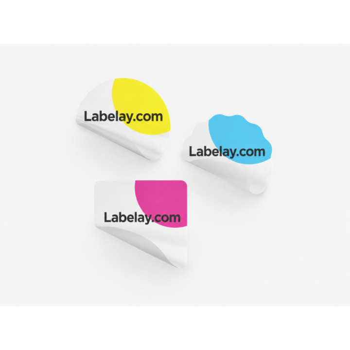
Cosmetic packaging often has very little room for error. Containers can be small, curved and handled with wet or oily hands, yet the finished product is expected to look polished at close range. Material and artwork therefore need to be planned together.
A useful starting point is to decide whether the package should feel visually transparent, clean and opaque, or deliberately decorative. That immediately narrows the choice between Clear Labels, White Labels and metallic materials.
Small packaging needs stronger hierarchy
A skincare jar or serum bottle cannot carry every line at the same visual weight. Brand name, product type and key variant information should be separated from directions, ingredients and other supporting text. Trying to make everything prominent usually makes the label harder to read.
Use enough contrast between text and the material beneath it. On clear packaging, the color of the product can become part of the background, so light typography may need white ink or a controlled opaque area.
Clear labels can create a clean cosmetic look
Clear material works well when the bottle or jar already has an attractive surface and the design is intentionally minimal. Transparent areas allow the package to remain visually open instead of adding a solid label panel.
The artwork should be built for transparency rather than simply moved from a white background. Review white underprint and spot white before finalizing pale colors or white logos.
White and metallic labels give stronger separation
White labels are the safest choice when color consistency and small text matter most. For premium lines, Silver Metallic or Gold Metallic can add controlled reflected areas without requiring every element to be metallic.
The key is restraint. Specialty materials are most effective when the artwork leaves space for the surface to show rather than covering it completely.
Proof the package at actual size
Cosmetic labels are often evaluated enlarged on a monitor. Print the artwork at 100 percent scale and wrap it around the real container before production. Check small text, margins, seams and whether the important information remains visible from the natural viewing angle.
Use the Artwork Guide for file setup and Get an Instant Price once the label size, material and quantity are finalized.
- Prioritize brand and product name before secondary information.
- Test clear artwork against the actual product color.
- Keep fine text away from extreme curves and seams.
- Use metallic effects selectively rather than everywhere.
Turn the guide into a real specification.
Choose your material, size, shape, finish and quantity, then see the price before checkout.