
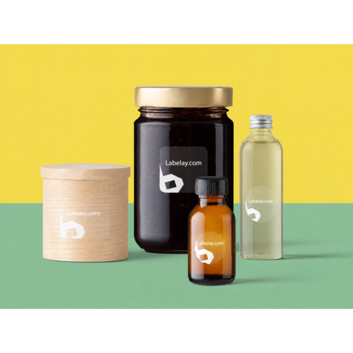
Bathroom labels are exposed to conditions that dry retail packaging never sees. Water, steam, wet hands and repeated gripping all become part of the real use case. The label also has to remain readable under reflections and around curved bottles.
Film materials are usually the practical place to start. White Labels offer a controlled background, while Clear Labels can keep colorful formulas and bottles visible.
Moisture exposure should influence the material decision early
A paper look may be attractive on screen, but the package may spend its life in a shower or beside a sink. If water exposure is normal, evaluate film first and test the actual bottle under realistic conditions.
For a deeper explanation of moisture terminology, read Waterproof vs Water-Resistant Labels.
Curved bottles need careful sizing
Many personal-care bottles taper or curve near the shoulder and base. A label that stretches into those areas can wrinkle or create edge stress. Measure the straight panel where the label can lie flat.
If the bottle is squeezed during use, test whether the label area flexes significantly and how that affects appearance.
Use strong contrast through water and reflections
Glossy bathroom surfaces and water droplets can make weak typography harder to read. Keep important product names and directions away from low-contrast combinations.
On clear material, remember that the liquid and bottle color become the background. White underprint may be needed for pale artwork.
Test the complete bottle before scaling
Apply the label, allow it to settle, then use the bottle in wet conditions. Inspect edges, print visibility and how the label looks when the bottle is partially empty.
When the construction is proven, use Get an Instant Price. For unusual materials or containers, send details through Request a Quote.
Turn the guide into a real specification.
Choose your material, size, shape, finish and quantity, then see the price before checkout.