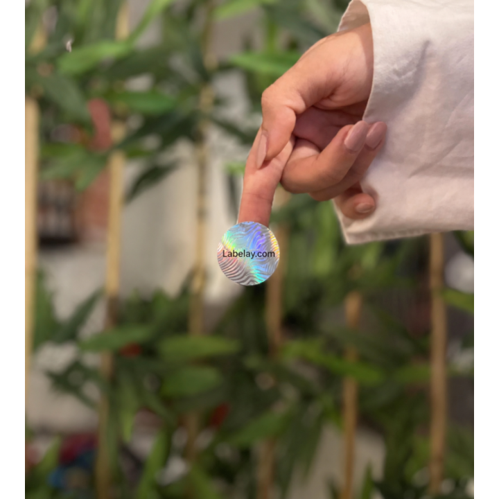
Round and square labels can occupy similar overall dimensions while giving the designer very different usable space. A circle creates a natural focal point but loses width near the top and bottom. A square uses the full area efficiently but creates a stronger geometric presence.
The better choice depends on the package, amount of information and visual identity rather than on a universal preference.
Round labels create a centered visual focus
Circles work naturally for logos, seals, jar lids and compact front labels. The eye reads them as a single centered unit, which can make simple branding feel strong.
The limitation is text. Long product names or multiple lines have less horizontal room near the curved edges.
Square labels use space efficiently
Squares and rectangles provide more predictable text width and are easier to divide into information zones. They work especially well for structured layouts, ingredients and product descriptions.
Rounded corners can soften the shape if a sharp square feels too rigid for the brand.
Container shape should influence the decision
A round label on a cylindrical jar can echo the package geometry, while a square label can create contrast. On boxes and pouches, straight-sided labels often align more naturally with the packaging edges.
Place paper mockups of both shapes on the real product before deciding.
Choose based on usable content area
If the design is mostly a logo and product name, round may be ideal. If the label must carry more information, square or rectangular formats often provide more efficient space.
For other options, read our custom shape guide and configure the chosen dimensions through Get an Instant Price.
Turn the guide into a real specification.
Choose your material, size, shape, finish and quantity, then see the price before checkout.