
Hot Sauce Labels: Choosing Material for Bold Bottle Packaging
Hot sauce bottles are small, colorful and often handled in kitchens. Learn how material, contrast and layout can keep the label bold without becoming chaotic.
LABEL GUIDES
Practical guidance on materials, artwork, packaging and ordering — written for brands that want fewer print surprises and a cleaner finished product.
Hot sauce bottles are small, colorful and often handled in kitchens. Learn how material, contrast and layout can keep the label bold without becoming chaotic.
Honey packaging is naturally visual, so the label should support the color of the product instead of fighting it. Compare clear, white and paper options for jars.
Spice jars are small, repeated across product lines and viewed at close range. Learn how to choose material, size and hierarchy for a cleaner shelf system.
Coffee labels need to communicate brand, roast and origin without overwhelming the bag. Learn how material, hierarchy and variation systems can work together.
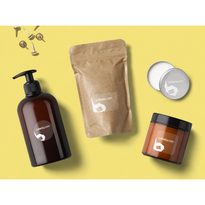
Beverage bottle labels need to work with the liquid, bottle color and cold-use conditions. Compare clear, white and metallic options before choosing.
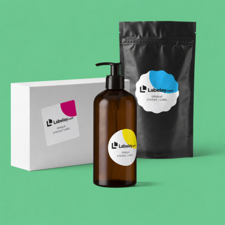
Soap packaging ranges from dry boxes to bottles used around water. Choose label material and artwork based on the actual format rather than the word soap alone.
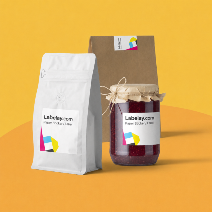
Food jars often need branding, flavor, ingredients and practical information in a small area. Learn how to create hierarchy without making the label feel crowded.
Candle labels need to work with glass, wax color and brand style. Compare paper, white film, clear and metallic options for a polished candle jar.
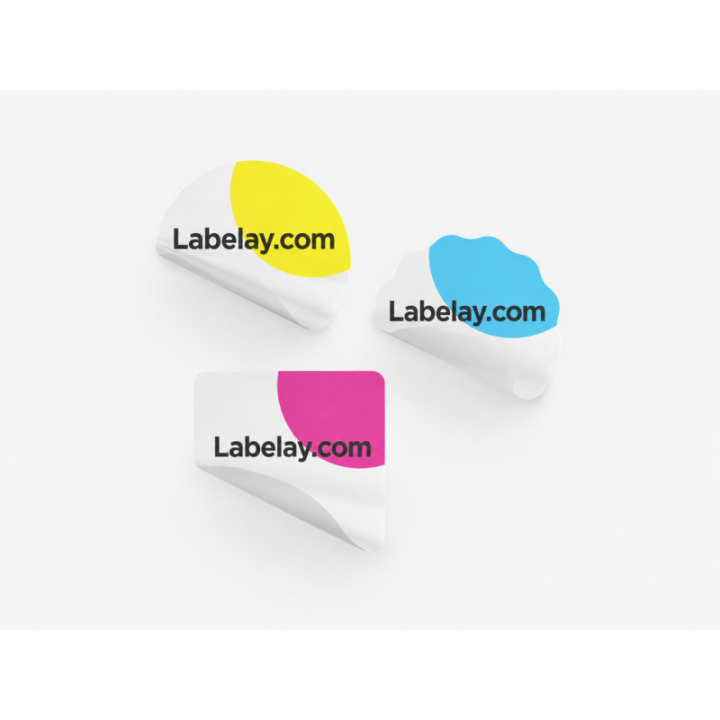
Cosmetic packaging combines small containers, moisture exposure and high visual expectations. Learn how material, contrast and layout work together.